Freeze My Seats
User Interface Design

Date July 3, 2018
Strategy Design Thinking
Role UI/UX Design
Create a website where a user can sign in, find a Venue and book movie tickets online.
Overview
Freeze My Seats (FMS) is Oman's First One-Stop Platform to book Movie Tickets, Concerts, Events, Sports & Theatre Tickets. FMS serves as an important part of Muscat's Entertainment Community. With the popularity of entertainment platforms like Netflix and Amazon Prime Video, the client expects to have an elegant and seamless, easy to navigate product with a Richer Quality. My duty in this project is creating user flows, wireframes & mockups.
How it all started
A while ago, I got an opportunity to do a UI project for Freeze My Seats, a ticket booking website based in Muscat, Oman. Though the website covers a multitude of theatres, Sports & events, its primary focus was for Movies and that’s the reason why I got this Opportunity. Due to My Love, Passion & Presumptuous Self-Confidence over Movies, I was chosen inevitably.
Since this was a project I was solely working on, as soon as I was brought in, I started looking for everyday problems and challenges that people were facing during the ticketing process. The annoyance they would feel while waiting in line for people, because the people ahead might be slow or indecisive. And I immediately empathised how I personally found it very frustrating to be waited in a long queue. Which made me think, “What would a customer like?”, who would most probably just want to book a ticket, arrive right before the opening and watch the show peacefully.
Problem’s & Design Statement
Problems from existing method:
Currently, the user only can Buy a ticket for a Movie or an Event through In-Person Only. Due to the absence of an Online Booking Platform and multiple unlinked theatre’s, the user had to pre-plan the whole Occasion based on Venue, timings & ticket availability. Which also makes it impossible for those Impulsive Entertainment Seekers, to walk in on a theatre as it has a risk of having a Houseful Show. Also Due to multiple theatres with no connection, the user had to check each and every venue separately in order to find what they have to offer.
Competitors
As FMS was the very first site for theatres I looked at the platforms I regularly used, in order to find what I like and dislike about their website and how I can integrate what they do and possibly turn it into an even better version.
User Stories
In order to insure success I created some requirements that the Freeze My Seats must fulfill in order to create a better user experience and a happy customer.
Users should be able to easily book a ticket online.
They should be able to see the list of movies and trailers that are showing.
They should also be able to pick the desired seat that is available.
Users should be able to select the theatre venue in which they want to see the movie.
He/She should be able to create an account and save their history of theatre and tickets.
They should also be able to pay using most common network payments.
Design Solution:
The User should have a Single Platform of Website, which will link to all the theatres and the shows which they Offer. This way they can identify the list of theatres & shows with their availability, and can make plans according to it.
Create a Website where people can select a theatre, book movie tickets and can view upcoming movies list. The Website should be responsive enough to book through a mobile browser. It should be user friendly and elegant.
User Interface
Colors
I used the color palette from the logo website, Other than the branding color, the one thing the client was so sure about was that the site should be Dark Themed, as they believed the current dark theme Trend would help them achieve the royal quality and a familiar feel to a dark theatre to enjoy the light of a show.
Site Map
The site map is showing how each page should be linked and interact with each other.
High Fidelity Mockup
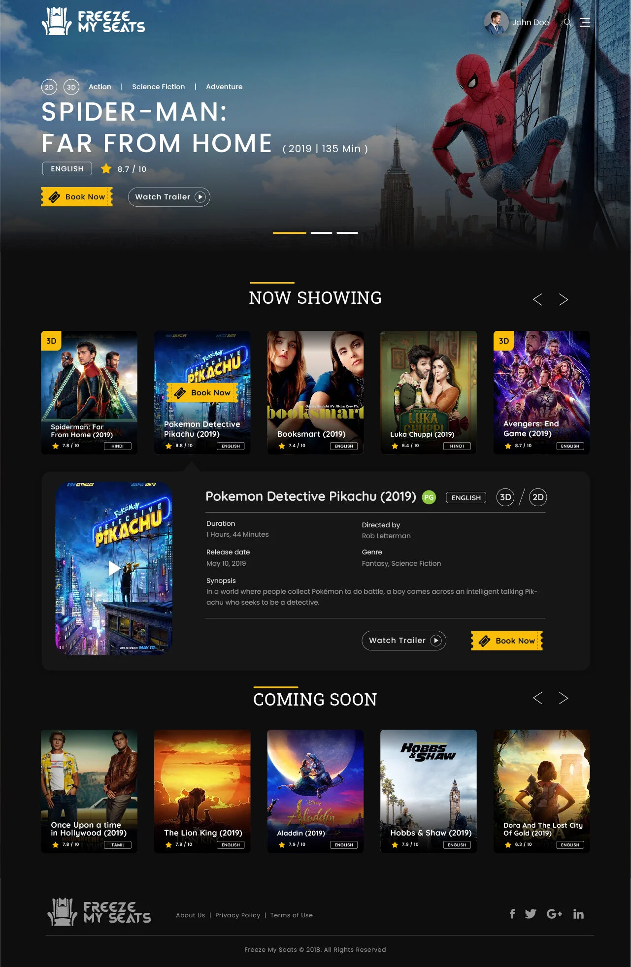
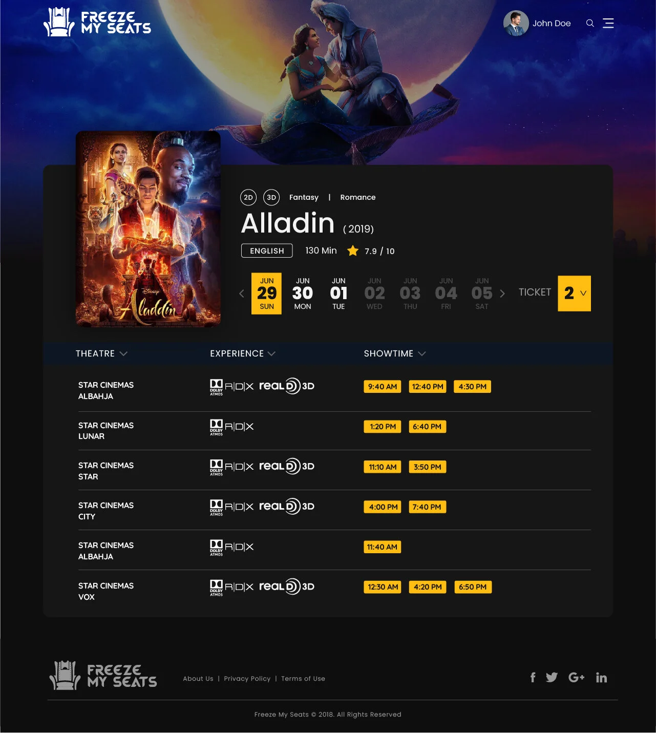
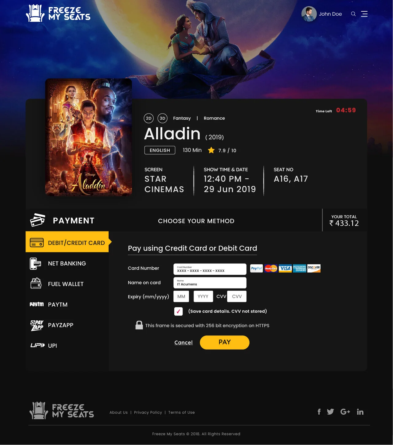
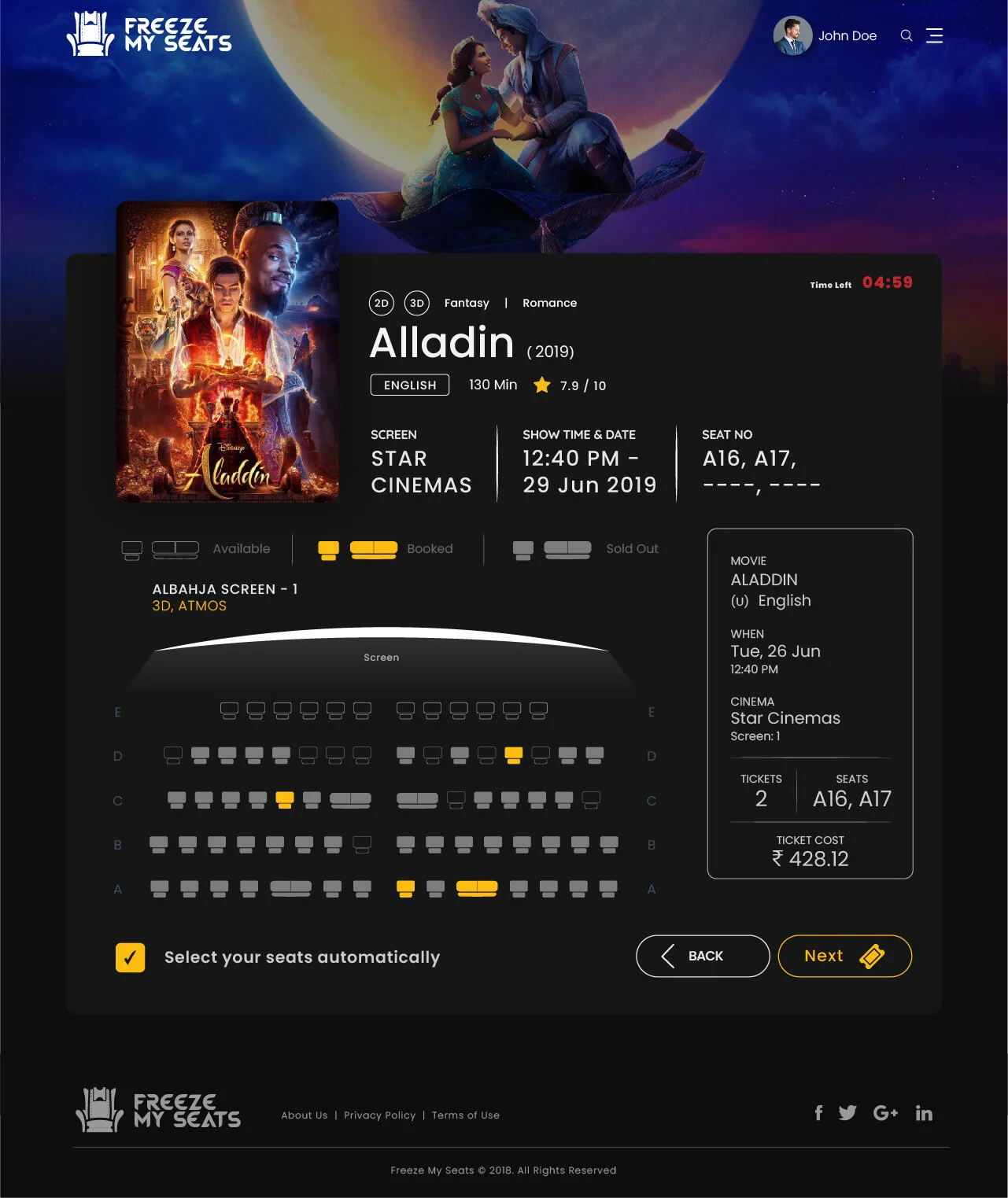
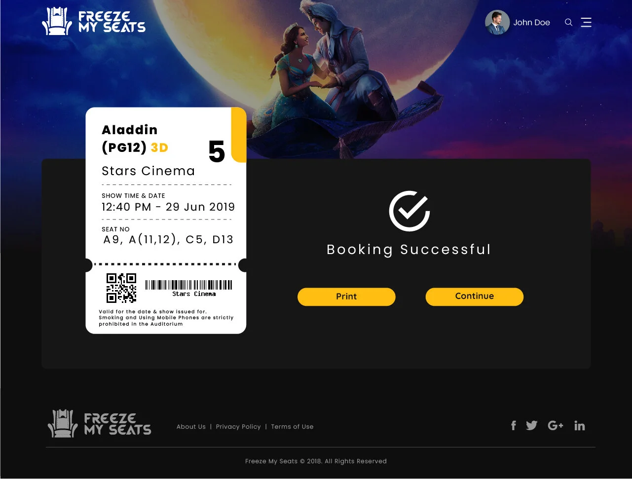
First Impression of the Website was Simple, Clean & Cool. The idea was to enhance the overall movie-goer experience by creating an elegant & exotic interface, that would create a magic for the audience's eyes, as similar as much as an actual film does.
Challenges
The colour palette and the Dark theme without a doubt was the most hard to crack. However, thanks to all the Inspirations I got from Dribble & Pinterest. The Mood Board that I created gave me a good starting point on how to approach the visual aspect and feeling I was hoping to achieve. This was my biggest project to date. For sure I felt Overwhelming during the project, but overall it was a very enjoyable process and I was very happy looking at the Final Product.
Reflection
As I was finalizing this case study, I realized there are few things that I could’ve improved:
Should not make assumptions on Problems but Work on user research and get proper research findings.
Conduct usability testing with actual users not just from co-workers in order to get authentic feedback.
Some pages could be improved on this website such as the movie listings page, but since the design process is only trying to solve a specific problem and its’ not backed by user research, I wasn’t able to add better features to the website without knowing how the user actually thinks or feels about it.


